Six years ago, if you would have asked me how much I used transform and pseudo-content, I would have told you ‘I don’t.’ Now, I use them a hundred times on large projects, and I can’t think of a project of any size in recent years when I haven’t used these tools to accomplish visual effects, animations, and slick, flexible layout solutions.
What are pseudo-elements?
If you’ve ever used :before or :after in your selector and it had the content style in it, you’ve made a pseudo-element. They get inserted into the DOM and can be thought of as free span elements that can have text that originates from CSS.
I don’t use them for text very often: their support in assistive technologies is spotty, and injecting text from CSS is the last resort for me.
They are great for creating extra elements that are needed for layout or design without having to clutter up your HTML. The most popular use is for .clearfix, but that’s just the tip of the iceberg.
What are CSS transforms able to do?
- Manipulate the visual representation of an element with translate, scale, rotate, skew, etc.
- Render in-between pixels with anti-aliasing effects
- Provide really performant and smooth CSS animations or transitions
- Kick-in graphics hardware acceleration
- Multiple transforms can be applied, and will be applied in the order they are listed
2D transforms that I use often
transform: translate(<horizontal length>, [vertical length]);
Move element around horizontally or vertically. Fun fact: a percentage can be used, and it will be multiplied by the dimensions of the element. So if a 200px wide element is moved 50% horizontally with translate, it will be moved 100px to the left.
For example:
/* Move element 50px left */
transform: translate(50px);

/* Move element 2rem right and 100% down */
/* 100% = height of element being styled */
transform: translate(-2rem, 100%);
transform-origin: <horizontal-position> <vertical-position>;
Determines where the transforms will be initiated. It defaults to center center, but can be set to other things like left top, right bottom, or you can use CSS lengths to define the position from the top left corner. See MDN's docs for great documentation and examples.
transform: rotate(<angle>);
Rotate the element in degrees. When animating you can spin an item multiple times by giving an angle more than 360deg. It's important to pay attention to transform-origin with rotations, it will make a big difference in how rotation is applied.
For example:
/* Rotate item 45deg from its center */
transform: rotate(45deg);

/* Rotate item 3 times, if animated it will spin 3 times, if not item won’t change appearance */
transform: rotate(1080deg);
transform: scale(<number>);
Scale will increase or decrease the size of the element. 1 is regular size, 2 will double it in size, 0.5 will make it half the size. transform-origin will make a big difference here too.
My favorite techniques involving pseudo-elements and transform
Use transform first for CSS transitions and animations
This has been covered a lot, but worth repeating.
Since transforms can render in fractions of a pixel using anti-aliasing animations, they tend to look smoother, and transform will always perform better in animations than other properties. However, if an item isn’t being animated, other layout techniques (margin, padding, position) will be a better choice.
So when animating, it's best to get the element to its starting position (or as close as possible) without transform, and then add transform to move it the rest of the way.
Vertical centering
In the past three years, we’ve gone from vertical alignment being a total pain to having multiple, reasonable solutions, but this one is my go to. It doesn’t matter if your element and/or its parent has an unknown height, or if those heights are subject to change. It’s less verbose than most of the other solutions, and only requires styles on the element being centered. It’s just tidy!
Codepen Example: codepen.io/wesruv/pen/pEOAJz
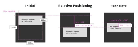
This works because top: 50% is calculated against the dimensions of the parent item, and translate is calculated against the dimensions of the element that’s being styled.
Here’s essentially what’s happening:
Understanding why that works is important, because there's also viewport units, rem, em, and px which can enable some slick layout options. For example, last month Thomas Lattimore shared how position, vw, and translate can be used to make an element as wide as the browser instead of being constrained by the parent container.
Aspect ratios in CSS (aka Intrinsic Ratios)
This comes in handy with components like cards, heroes with images and text over them, and videos. Let's take videos since they are the cleanest example.
If you know the aspect ratio of your videos, there is no need for a JavaScript solution like fitvids.js.
Usually, the most reliable way to get this to work correctly is to use a pseudo-element and absolutely position a content-wrapper, but, in some cases, it might be better to bypass a pseudo-element.
Let’s say the HTML markup is div.movie > iframe.movie__video, and the movie is 16:9; here's how I would implement an aspect ratio so the movie can have a fluid width:
.movie {
  position: relative;
}
.movie:before {
  /* This will setup the aspect ratio of our screen */
  content: '';
  display: block;
  /* content-box makes sure padding adds to declared height */
  box-sizing: content-box;
  width: 100%;
  height: 0;
  /* Vertical padding is based on parent element's width */
  /* So we want 9/16, converted to % as our vertical padding */
  padding: 0 0 56.25%;
}
.movie__video {
  /* Now we need to absolutely position content */
  /* Otherwise it'll be pushed down by the :before element */
  position: absolute;
  top: 0;
  left: 0;
  width: 100%;
  height: 100%;
}
Codepen example: codepen.io/wesruv/pen/peYPWo
This method is performant and will work back to IE5.
I've also used this technique for card teasers with large images. Beware, the text is in the absolutely-positioned content area you have to guarantee the text won't flow out of the box. There are modern text overflow techniques that can help, but ideally, your content writer will follow the length limits of the design.
Pseudo-elements for complex background position rules
Let's say the design calls for a background image that covers half of its wrapper, and we need background-size: cover so that the image fills half of its parent as the parent's dimensions change for responsiveness.
Another element could be added, cluttering up your HTML, or we can make a pseudo-element to lay out however we want, and then have access to all of the background positioning rules on top of that!
.hero--half-cover-image {
  position: relative;
  }

.hero--half-cover-image:before {
  content: '';
  position: absolute;
  top: 0;
  right: 0;
  display: block;
  width: 50%;
  height: 100%;
  background: gray url(/images/fillmurray.jpg) no-repeat;
  background-size: cover;
}
Codepen example: codepen.io/wesruv/pen/PpLmoR
CSS art
By 'CSS art' I mean simple icons made with CSS as opposed to icon fonts or images. This doesn’t work for all the icons you might have in a design, but for chevrons, hamburger, and search icons, you can save assets and file transfer and gain the ability to change the color, layout, size, or style of the icon on interactions or custom triggers.
You could also do these effects with SVG, but that has more compatibility issues (at present) and can mean more data for the user to download to produce the same effect.
I've been creating a number of these in Codepen and re-using and customizing them on multiple projects.
- Animated Hamburger Icons: codepen.io/wesruv/pen/pEOAJz
- Close Button: codepen.io/wesruv/pen/pEOAJz
- RSS Feed Icon: codepen.io/wesruv/pen/yOxEYj
- Drag Icon: codepen.io/wesruv/pen/oxVZmw
- Search Button: codepen.io/wesruv/pen/ZBvvVK
I've also recently been making fairly ornate infographics using these techniques, while it's a fair amount of work, the content in these needed to be accessible and SEO friendly, and as the text might change, I needed the containers to be flexible and be based on the copy.
Artificial Intelligence Stack
Interactive graphic meant to explain the different technology and planning that has to go into artificial intelligence.
Codepen Version: codepen.io/wesruv/pen/VXzLpZ
Live version: ai.cs.cmu.edu/about#ai-stack
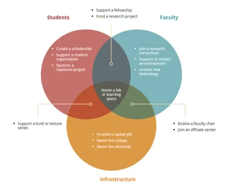
Venn Diagram
Graphic used to explain information that was core to the page, unfortunately it ended up not feeling like the right visual metaphor.
Codepen Version: codepen.io/wesruv/pen/RjmVvV
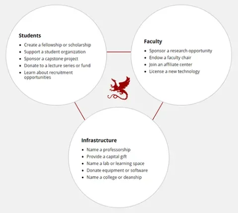
Connected Circles
What ended up replacing the Venn Diagram to explain the main ways a company or individual can partner with Carnegie Mellon's School of Computer Science.
Codepen Version: codepen.io/wesruv/pen/ppOmVq
Live Version: www.cs.cmu.edu/partnerships
A little trick I've learned—on more ornate CSS Art that has small parts that have to meet up—I will usually add a div to contain the element. I’ll make the icon much larger than I need it to be, and use transform: scale() on the div to shrink it down to the appropriate size. This avoids subpixel rounding issues that make the icon look off.
For instance, on a small magnifying glass icon it can be very hard to line up the handle (diagonal line) with the lens (a ring) if the icon is 20px wide. Pixel rounding may cause the handle to pierce the circle, or it may not meet the circle at the right position. Working larger, at 100px wide, and then shrinking, by scaling to 0.2, we avoid this issue.
Potential gotchas or risks with using transform?
transformonly visually moves elements, the element will still occupy the same space in the layout it had before as if thetransformstyles weren’t there.- Occasionally when an item is anti-aliased from a transform, it can make some elements appear ‘fuzzy.’ This can be noticeable on small text or small graphics.
- Using 3D transform will use graphics hardware acceleration, which can waste a phone's battery faster.
- Some 3D transforms can cause serious rendering issues on phones. Parallax and 3D-heavy transform effects should usually be turned off at smaller breakpoints, as mobile devices lack the computing power to handle these effects smoothly.
- Browser compatibility is IE9+ for 2D and IE10+ for 3D (with caveats), use Autoprefixer to know if your site needs
-webkit-prefix along with non-prefixed style.
Potential gotchas or risks with using pseudo-elements?
- Technically you should use
::beforeand::after, but IE8 only supports:beforeand:after(one colon), which doesn't matter that much, but single colon works everywhere and is one less character to type. - Make sure the
contentstyle is in your pseudo-element styles, even if it's an empty string. If you don't, the pseudo-element won't exist.


