Long gone are the days of using HTML tables for page layouts. That time almost seems shrouded in myth. One of the (many) reasons tables fell out of use was the advent of responsive design to meet the needs of different contexts and screen sizes. Tables are rigid. Their presence naturally hampers the responsiveness of a website to conform to a smaller screen size.
But tables are still useful. In some cases, they are necessary.
Tables are an important resource for any organization that wants to communicate tabular data on the web. They often serve as a bridge between traditional spreadsheets and online presentations. However, over the years, HTML tables have been misused, and attempts to adapt them to different devices have frequently resulted in poor usability or a failure to display all the required information.
How do you present HTML tables in a responsive and accessible way? And how do you do it so editors don't get frustrated with extra work?
Other approaches to responsive tables
The most popular approach for adapting tables to small devices is to linearize or stack the rows one on top of the other, converting a table to a list.
See this example table as presented on a larger screen:
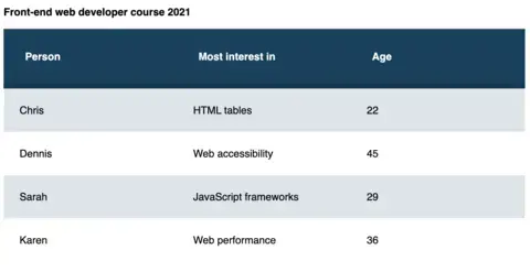
This is a table of front-end developer courses on a large screen.
And now that same table "stacked" on a mobile device.

This is the same table on smaller screens, now with stacked rows for easy scrolling.
Stacking works well for some tables, specifically for data where comparison doesn't matter. Above, the list works for a table showing candidates for a position. But when you have large tables with data intended to be compared against each other, the stacked mode doesn't work as well. Take this example of a table with more columns.
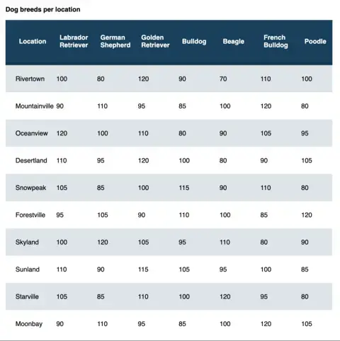
A table intended to compare columns.
When we convert it to a stacked mode for mobile, it requires a lot of scrolling and loses its usefulness for comparing columns.
This table isn't that large—it only contains ten rows and eight columns. But even with such a small dataset, the desktop version is more concise and easier to compare columns and rows than the mobile version. The stacked version for smaller screens becomes long, adding a lot of vertical scrolling to the page, making for a bad UX experience.
The data in the example above looks similar to what you'll usually see in a spreadsheet, so how do spreadsheet applications render on mobile? Here's the same data on Google Docs.
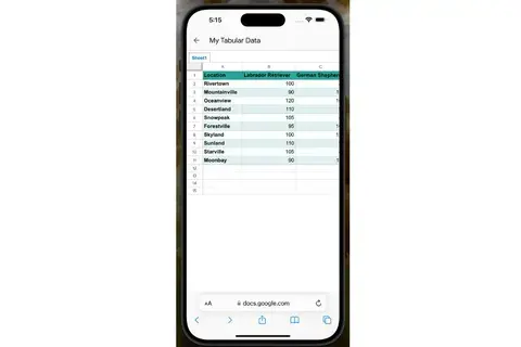
The dog breeds table on a Google Spreadsheet, in portrait mode on a mobile device.
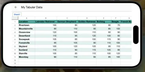
The same table on a Google Spreadsheet, but in landscape mode on a mobile device.
This table is much more readable on mobile than if it was converted to stacked mode.
We don't really know which structure tables will have. They could have thousands of rows, columns, row headers, merged cells, and virtually all kinds of formatting options, making it difficult to always convert them reliably to stacked on mobile.
The perfect solution will depend on each table, but in a CMS, you don't know how large or small the tables will be. A List Apart article describes the problem:
For small screens, such as phones, designing readable tables which work under such cramped conditions presents us with a serious challenge. The best approaches always deal with each table on a case-by-case basis, but that’s not always possible if we need to generically style whatever comes out of a CMS database.
Our conclusion: The best approach for mobile would be to modify tables as little as possible but without creating a horizontal scroll on the whole page.
Our approach to responsive tables
We created a JavaScript plugin that "wraps" tables around a container and provides controls for navigation, similar to how spreadsheets work. Below is the final result using the same data as above:
This approach is much more readable than stacking the table and doesn't modify the table structure. It works with all kinds of tables as long as they are well-formed.
At the same time, the plugin is smart enough to compare the table width against the container width and add the navigation controls when necessary, which means that even on a desktop with a narrow container, the plugin will add these controls automatically for HTML tables with many columns. For example:
The plugin is fully accessible to screen readers and other assistive technologies. It wraps the table with a div with overflow-x: scroll; which means users can scroll the table using the displayed controls, tapping for touchscreens, or using the native scrollbar at the bottom. We also included the necessary aria tags so it can be navigated solely with the keyboard.
Note that although horizontal scrolling is typically bad for accessibility, data tables have an exception. From the WCAG success criteria for reflowing content:
Data tables have a two-dimensional relationship between the headings and data cells. This relationship is essential to convey the content. This Success Criterion therefore exempts data tables from needing to display without scrolling in the direction of text (e.g., horizontally in a vertically scrolling page).
As a bonus, the plugin analyzes the table rows, and depending on the average content of the columns, it will resize them to make them look better. For instance, if the columns have mainly numbers, they will be sized down, and if they have large text, they will be sized up.
There is still a use case for "stacked" mode on mobile devices, so we also provided an option for forcing specific tables to be rendered as stacked. Tables whose structure can't be modified by CMS editors and contain lists of links are good candidates. Adding the class tabled--stacked to the table will make any table render as "stacked" on smaller screens.
This JavaScript plugin is now available for anyone to use and contribute to.
Accessibility improvements for Drupal tables
In order for tables to be accessible, they always need to contain captions and headers. Unfortunately, the CKEditor table plugin provided by Drupal doesn't enforce this, so we helped create our own CKEditor 5 plugin, which makes the caption field mandatory and always adds table headers. The table creation dialog looks like this:
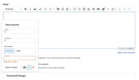
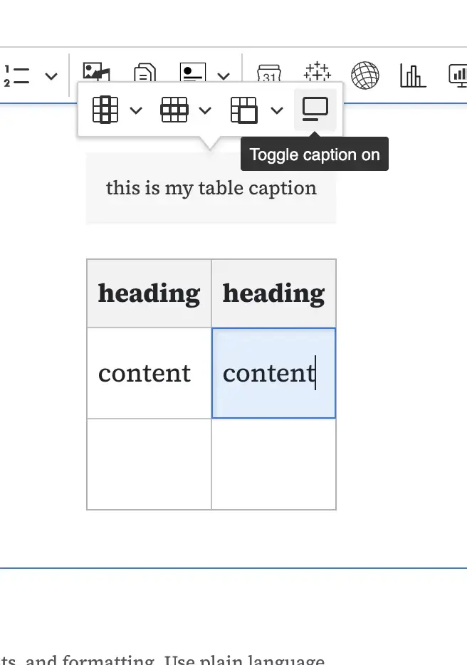
Users cannot submit the dialogue if the caption field is empty. Although we added a checkbox for hiding the caption, the element will be visually hidden but visible to accessibility technologies like screen readers. The caption visibility can also be toggled with a new contextual button after creating the table.
The other main difference is that table headers have two options.
- First Row is the default, which makes the first row of the table its headers.
- Both will create headings for both rows and columns.
You can't choose not to have table headers.
In this way, we ensure that all manually created tables are fully accessible both in terms of their structure and when rendered through the Tabled plugin.
Be aware that the new plugin will ignore tables copied and pasted from external sources or embedded in other tables. It is the editor's responsibility to adjust or recreate these tables.
Conclusion
Tables aren't going anywhere. They are still a vital part of the web, as long as we aren't twisting them toward purposes for which they were never intended. Our approach to responsive tables helps make them easier to navigate on smaller devices without putting more pressure on editors.
Download the plugin and give it a try.
This work was made possible in collaboration with Stephanie Ganzer and Kat Shaw.