Designing as a team can be challenging. This is especially true with larger and more complex projects as well as with larger teams. At Lullabot, our design team has encountered many of these challenges, and as our team continues to grow, I’m sure we’ll encounter many more. If you've ever tried to produce and maintain wireframes with several other people, you know the pains of sharing assets and making sure everyone has the most up-to-date version of what they’re working on. Is everyone using the same icon set or the latest logo? What screen sizes should we wireframe for? Is asset consistency across wireframes important? As a team, these are the questions that we’re constantly asking ourselves. It’s important to be proactive in sharing assets and communicating updates and changes. With larger teams, this can sometimes seem unmanageable and frustrating. You can easily spend more time checking for updated assets, than working on the design itself. In the past few months, the Lullabot design team has grown considerably. This growth has led us to look for ways to improve our processes and work more efficiently together. We began by tackling one of the more basic and early parts of a design project, wireframing.
A common starting point
When we start the process of wireframing, it’s a fast-paced process of creating pencil and paper sketches. The goal is to collaboratively produce lots of ideas for ways to solve the user problems.
Iterating through ideas on paper seems to jump-start creative collaboration. We typically try to do this rapid ideation work together in one place during a UX workshop. Being together provides creative energy, and also makes it much easier to brainstorm at a rapid pace. After the workshop, we begin refining the rough sketches into more formal ideas. We also begin testing those ideas further by increasing content fidelity. It's at this point where we begin to be able to divide and conquer, with each designer taking on a different wireframe to start exploring UX ideas with the goal to produce a more formal document that we can review as a larger team and perhaps turn into a prototype. With our team now working in different places on different files, how do we quickly start to produce refined wireframes with consistency?
On a recent project, we chose to use Adobe Illustrator to refine our early sketches due to our tight timeline and the team’s familiarity with the tool. It was an experiment. We wanted to establish an environment of rapid exploration; static wireframes will eventually be tested in browsers as prototypes, but we often rework or reject rough ideas before investing time in building those prototypes. Working in Illustrator has helped our design team strike a balance, pretty easily achieving high content fidelity while allowing for quick iteration. These wireframes produced in Illustrator also feel "cheap" enough that the team is unafraid to discard ideas that don't work or refine until they do.
Our team agreed that one thing that could be extremely helpful as we manage several people creating these wireframes would be to have a common starting point. We needed a boilerplate or template of sorts. This would ensure that we would all be using the same typography, symbols, and components—and save time normally spent searching, assembling and importing everything when starting a new wireframe. A custom AI template seemed to be the most direct answer; they're flexible, and can change and grow as the team discovers new needs. They can also be customized for specific projects. We use our template as a launching point, then add in project-specific assets as needed.
We set up a very basic blank template. From there, we linked to Illustrator files for global assets that we needed to share such as logos, approved navigation, header and footer assets, etc. Disclaimer: this isn’t a proven solution. Heck! We might even change as we explore new tools to help improve our processes as we grow. But it’s a place to start, and that’s what we needed.
What’s in our template?
We began by creating a custom AI template and saving it in a place where everyone on the team could access it (in our case a project dropbox). We basically removed all the default graphic styles—colors, patterns, etc and replaced them with starter assets our team needed for wireframing. What’s in our starter template you ask? The bare minimum so we can very quickly customize as needed.
- A few different-sized art boards to demonstrate breakpoints
- Color palette
- Basic components used as symbols

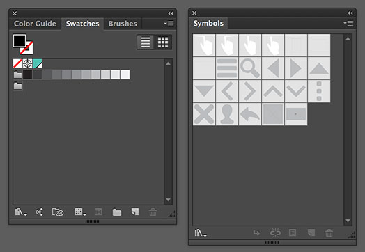
The color palette and symbols. For colors we stuck with basic grays and added a highlight color.
- Paragraph styles
- Graphic styles to use for buttons

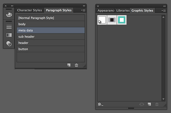
We set up paragraph styles for a few common elements that needed a consistent type style between wireframes. We also set up a couple of graphic styles for buttons.
- Possible grid setup
- Line work for browser window, tablet and smartphone saved as symbols
We also set some basic preferences. It’s not always mandatory, but we found that setting up the preferences of the template can help avoid small mistakes (CMYK vs RGB for example) and can save everyone just a little time.
Using global assets
Creating global assets can help save time and ensure that everyone working on the wireframe is using the most up-to-date version of a shared component. You may want to think about creating global assets for items used across wireframes such as navigation and footer information. We thought that Illustrator might have streamlined this process with their new library panel, but it seems like sharing assets among team members is still pretty limited.
To create a global asset, create an AI file of the specific component and save it in a place like Dropbox where everyone in your team can access it. Have your team members import the AI file into their wireframes and place where needed. If there are any updates that need to be made to the global asset, all you have to do is open the original file, make the changes and save. It will then update in all of the files that the asset was imported to.
Communication is key
It’s important that the team working together is in constant communication. Assets, requirements, and components constantly change, and it’s important that the team working on a project is communicating these changes to one another. It ensures that everyone is using the correct logo, or understands a requirement update that might impact several wireframes. It’s a little more of a challenge for our team because Lullabot is a distributed company. Walking across the cube farm and tapping someone on the shoulder isn’t possible. Nevertheless, things like brief daily stand-up calls (we use Google hangout for these) and a project basecamp for communication seem to work very well for keeping us all on the same page. Basecamp is a great tool for documenting requirements and functionality. We also use it to directly communicate with our clients and to post questions and comments that we want to open for discussion amongst our team. We also keep each other up to date on work in progress. We’ve found that the quickest and most efficient way to share unfinished work is to hop on a Google Hangout and share screens. InVision is another tool that we use to share both work in progress with our team and our finished wireframes with the client. InVision allows you to leave comments and even "live share" static, visual assets. When you live share a wireframe or design, everyone can see and follow everyone else's cursor and even draw on and write on things together. Live shares are a great way to create a studio environment for group critiques for a distributed design team.
Conclusion
Wireframing together as a team can be very rewarding. Team collaboration can help elevate the best ideas and create a supportive environment for creative experimentation. While the early ideas for structure, layout and functionality of a design system need to be formed collaboratively, the honing and refinement of that design system can be achieved much more quickly by a team that divides and conquers, as long as there's a system in place for constant communication and sharing of assets. A template is a great way to ensure that your team members are all starting off on the same place, and can save you the time of searching for and importing assets. Making sure the team is communicating can help reduce frustrations with updated information and assets sharing, and can lead to a more productive, happy UX experience for both you and your client.


