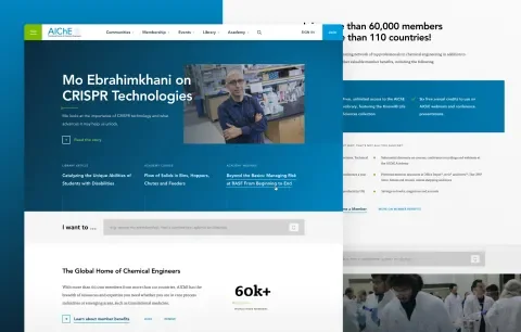
AIChE is the world’s leading organization for chemical engineering professionals, with more than 60,000 global members active in over 100 technical communities. The size of their audience and content library created unique challenges for the end-users and those who manage the content. AIChE needed to make content more easily accessible, and help community leads reach their communities’ goals. Together, we created a new site with improved information architecture and UX and a new design system for continued growth and innovation.
Finding Focus
With such a vast site, finding focus was challenging. We knew that rethinking every aspect was not feasible or helpful, so we identified key challenges and goals to give them the greatest return on their investment. We did an initial UX Audit to evaluate and prioritize the challenges and goals for the site through research and analysis. In just a few weeks, we conducted the following research:
- Interviewed site users, technical community leads, and web team members to identify common problems and thematic desires for the site.
- Reviewed past site analytics, member surveys, and other research the AIChE team had used to increase clarity and validation.
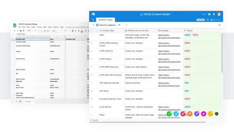
- Conducted a design inventory of all custom pages and components, and reusable templates and design patterns that make up the site to identify opportunities for simplification and consistency within the user experience.
- Reviewed the existing information architecture, looking for organizational patterns and nomenclature that didn’t match with user expectations.
- Synthesized our findings into ideas to begin testing within our design process.
Taking our findings from the UX audit, we worked with AIChE to prioritize goals for the redesign. We prioritized via multiple axes, evaluating the perceived level of effort required to accomplish each goal with the positive impact it could have for AIChE and its members.
This work was incredibly beneficial. It helped us hone in on the most critical problems to solve, bringing focus to our work and constraining it to what was feasible and high impact.
Helping a Broad Audience Zero in On Their Unique Needs
A common challenge with any large site with a broad audience is how to present what’s most important to most people most often and creating easy pathways to that information. In AIChE’s case, links to events and conferences, technical communities with a lot of content, and membership information were getting lost in a sea of content and links. We improved the information architecture and way-finding for all audiences through several means and methods, including:
- Reorganizing sectional groupings within the site to include both technical communities and higher-level topical categories that resonate with members who are less familiar with the specific technical communities.
- Providing new way-finding tools that let users quickly jump to high-frequency content and tasks.
- Improving visual hierarchy with greater proportional and contextual contrast to draw out important news, conferences, and topics.
To ensure the success of our new designs, we conducted usability tests with AIChE members. The feedback we received in these tests was highly valuable and encouraging. We arrived at a new AIChE.org that provides a great user experience from day one and establishes a pattern for future iteration as AIChE continues to grow and evolve.
Establishing a Beautiful and Sustainable Design System
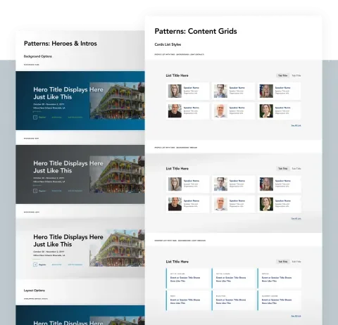
AIChE’s website is essentially a network of sites for various technical communities, initiatives, events, and more which all operate under the AIChE brand. To improve the user experience through consistency and create a more sustainable site for the small team of maintainers, we created a design system, not just a new site design. The design inventory produced within our UX audit helped us identify what was happening within the current site, and opportunities for simplification that might increase consistency and sustainability.
We prioritized the parts of the system into primary, secondary, and tertiary groups based on feedback from the wider group, including usability tests with members. The parts of the system that impacted the most stakeholders within AIChE had high user interaction, or had more significant organizational investment associated with them received more time within the design process. Having these clear priorities empowered the team to be efficient with the parts of the system that were more utilitarian, having infrequent user interaction, or more straight forward requirements. In the end, we created a new design system that satisfies members, and that could be implemented successfully with a team of just two developers (one back-end and one front-end)!
Creating Better Ways to Measure Site Success
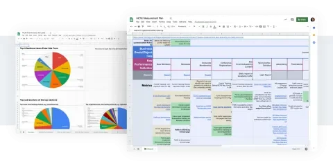
In addition to conducting usability tests within our design process to ensure a user experience that worked, we also established tools and methods for the AIChE team to evaluate the efficacy of the new design after it launched. Organizations like AIChE invest a lot in their web properties and therefore need reliable ways to assess that investment. We worked with their team to identify organizational goals and map them to measurable key performance indicators within their site and then implemented site analytics for each one. Within the first month after launch, we saw promising results from the new design, and what’s more, the AIChE team has the tools now to continue improving the site’s performance based on data.
Lullabot’s approach never overwhelmed us but instead pushed us to have a better appreciation of our audience, our content, and our process. They worked closely with our marketing team and business units to create a website and design system that not only respects our brand but enhances it. Our users are beyond pleased with the new UX.
John Vasko, Director of Communications & Online Content, AIChE
Project credits
The following people contributed to the success of this project.
-
Greg Dunlap
Former Director of Strategy
-
Jared Ponchot
CCO
-
Marissa Epstein
Senior UX Strategist
Services
We provided the following kinds of services to help this project succeed.
-
Digital & Content Strategy
-
Front-end Architecture
-
Front-end Development
-
JavaScript
-
UI Design
-
UX & Design


