Merative, formerly IBM Watson Health, is an established data, analytics, and technology partner for the health and social care industries. As a new brand, it needed flexible design and branding expertise to maintain momentum and attract new customers for its six product lines - all of which have their own identity and mission.
We provided embedded design support to help Merative rebrand its website, accomplish its short-term goals, and realize its long-term vision.
A unified design system
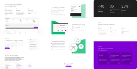
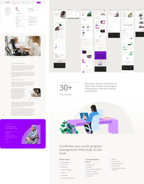
When we began, Merative’s website contained only a few pages. We analyzed and crafted an information architecture and then explored designs, patterns, and variations to extend the new brand to the rest of the site.
We then reviewed each sub-product and crafted a unified look and feel using a monochromatic palette. This palette extends to illustration and photography, providing a distinct style across all their products while maintaining a cohesive Merative parent brand.
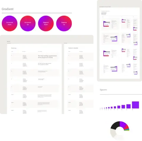
The new design system includes brand and style guidelines, a pattern library, and documentation on how to use it. It’s an easy-to-use reference when creating consistent and accessible pages within Merative.com and across all digital channels.
Crafting other customer touchpoints
Reviewing Merative's product families allowed us to step back and spot commonalities, which led to system-wide improvements to the end-to-end user experience. Based on our findings, the product management, marketing, and sales teams collaborated to refine the customer journey map, now used as a blueprint for new products.
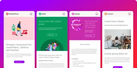
Additionally, we helped design email campaign sequences to increase customer retention and engagement. Event managers, product marketers, and content directors now have templates and a guide to help them craft their messages. We also increased Merative’s newsletter signups by researching the best places to add promos and signup forms.
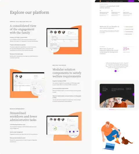
To create a strategic touchpoint in the RFP process for prospective stakeholders, we designed a microsite for Merative's product, Cúram. Site visitors can easily explore key features, find resources, and contact their representatives. This microsite will be used as a template for their sub-products.
Improving the support experience
As part of an audit, we discovered that most requests from the primary CTA, Contact Us, were support-related. We leaned into this tendency but also wanted to improve the customer journey.
We designed a contact form for each product family, tailored specifically to that product’s user needs and business goals. The contact pages now have additional resource links that empower customers from the beginning of their support experience.
Lullabot was a tremendous design partner in creating Merative.com. Their attention to detail, vision, and creativity for our digital design system propelled Merative.com to where it is today.
Services
We provided the following kinds of services to help this project succeed.
-
Accessibility
-
Digital & Content Strategy
-
UI Design
-
UX & Design

