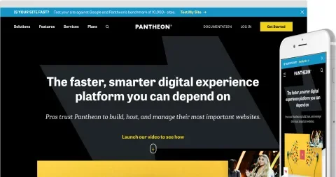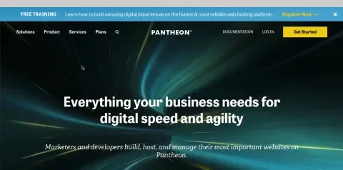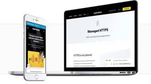
Pantheon is a website hosting and development platform that both marketers and developers love. As the platform evolved, their website hadn’t kept up to adequately tell their story or speak to audiences beyond developers. We partnered with Pantheon to help their team hone in on a new aesthetic and communication strategy. Within a tight nine-week timeline, we redesigned, built, and launched version one of a great new website!
A Sustainable Design System That Balances Consistency and Flexibility
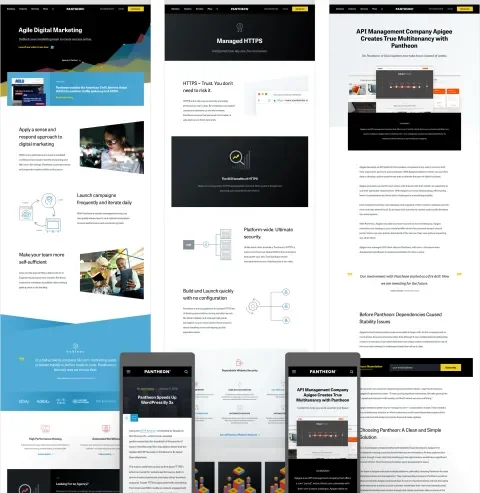
Pantheon’s website had outgrown its original design which led to pages composed of many discreetly designed and implemented components. These components often did the job individually of delivering the messaging, information, and tasks they were designed for, but the variety and multitude of them led to a fractured user experience and challenging editorial process.
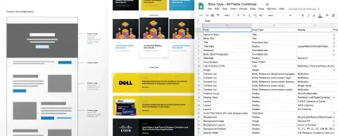
Our designers conducted an interface inventory and audit to define the smaller subset of design patterns needed to accomplish the kinds of components in use within the existing designs. We developed a design system model that broke down the various design patterns into their respective attributes and defined how each related to the content model within the CMS. This helped us strike a balance between design, content flexibility, long-term consistency, and sustainability.
Pantheon’s designers were then able to focus on creating supporting design elements such as graphics and backgrounds rather than starting from a blank canvas and working with a developer for every component. Their content team was also able to manage things like a platform feature or customer quotes in one place and re-use it in various ways throughout the site. New components could be built quickly which resulted in a more consistent design that’s easier to iterate on and maintain.
Simplified Navigation That Maps to Users’ Needs
The navigation design had been stretched beyond its original intent and was no longer effectively serving customers’ needs. User research that looked both inward (Pantheon’s sales, customer support staff, marketers, designers, developers, etc.) and outward (Pantheon’s existing customer base and non-customer target audience) showed that the marketing and design teams’ desire for a new, simplified navigation was shared by customers and prospects.
Leveraging insights from our user research during a few days of live workshopping, we began collaboratively designing with Pantheon, including exploring and iterating on ideas that had been brewing within their team. We then used in-process user testing to validate these ideas. This resulted in a more simplified and user-friendly navigational structure that maps to users’ needs and Pantheon’s messaging.
A Priority-driven Approach for a Short Time-frame
One of the greatest challenges of this project was being ready to launch a “minimum lovable product” in less than three months. Using our early design system model, we broke down the parts of the site that were most critical to success by dividing them into primary, secondary, and tertiary groups:
- Primary Group: Pages, templates, components, and patterns that were most important to the marketing team and required the most time for iteration and refinement
- Secondary Group: Things that would need to be accounted for within the new design system, but wouldn't require as much stakeholder feedback and iteration during the redesign process
- Tertiary Group: Things that eventually needed to be accounted for, but could perhaps wait for a phase two rollout
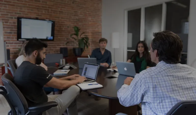
This priority-driven approach enabled strategists, designers, and developers from Lullabot and Pantheon to work together in an agile fashion. Our team could run with high-priority items while Pantheon’s team worked on covering all the others. Together, we created and implemented a new website on time that made us all proud.
A Pantheon Site That’s as Fast as the Pantheon Platform
One of the key benefits of Pantheon as a platform is speed. Their innovative technology provides incredibly fast hosting for hundreds of thousands of sites, and their industry-leading tools allow for best-practice-driven efficiency and speed within the development process. Our goal was to ensure that their website reflected the speed that their product is known for. To accomplish this we:
- Improved rendering performance. The rendering time was cut in more than half from nearly 2.5 seconds to less than a second.
- Reduced the time to first interactive. This time was reduced from 4800ms to 1600ms.
- Increased performance scores. After some front-end enhancements, we took Pantheon’s overall performance from a D to a B (A with third-party scripts deactivated).
- Decreased the CSS bundle size. This was decreased from 1.4MB to 450Kb, primarily by taking advantage of http/2 and loading only the CSS necessary for the components used on a page, rather than a large aggregate that contained the CSS for all the pages.
- Optimized JavaScript. Rendering was unblocked by disabling the loading of unnecessary libraries.
- Preloaded fonts and hero images. This prevented a flash of unstyled content.
For more detail on these front-end performance techniques implemented by Marc Drummond and Mike Herchel, read Mike's article, Making Legacy Sites More Performant with Modern Front-End Techniques.
I don't think any other shop could have delivered as much work within our timeline as Lullabot. I'm truly pleased with these new tools and everyone loves our new look.
Michelle Buggy, Senior Marketing Designer, Pantheon
Project credits
The following people contributed to the success of this project.
-
Helena McCabe
Technical Account Executive
-
Jared Ponchot
CCO
-
Marissa Epstein
Senior UX Strategist
-
Nate Lampton
Senior Technical Architect
-
Jerad Bitner
Senior Technical Project Manager
-
Heather Drummond
Former Senior Front-end Developer
-
Mike Herchel
Former Senior Front-end Developer at Lullabot
-
Jeff Eaton
Former Senior Digital Strategist
Services
We provided the following kinds of services to help this project succeed.
-
Digital & Content Strategy
-
Drupal Development
-
Front-end Development
-
Performance and Scalability
-
Technical Architecture
-
User & Market Research
-
UX & Design

