Web experiences depend on many diverse elements: who is using a site, their goals, device, and connection speeds, other expectations, ability, and even mood. And that's before we get to the myriad of factors within each unique project. Because of this, "It depends" is a perfectly viable answer to many questions regarding a website, though it may be annoying to hear.
So, let's explore context to understand better the impact of different situations on crafting inclusive and adaptable systems. What is context, what types of context are there, and why does this all matter?
Why does context matter anyway?
We love asking questions that can't be answered to illustrate this point. What's the best meal? "It depends!"
Do you want a small plate, or is it about home cooking? How soon do you need the meal? Do you have dietary restrictions that override all other factors? Have you had take-out Chinese food three times in the past week? "It depends." And there are many more questions we could ask in this domain.
"It depends" is something we say all the time. It's even become a joke with some clients, but we say it because it's true.
Oxford Languages defines context as "circumstances that form the setting for an event, idea, event, statement, or idea, and in terms of which it can be fully understood and assessed." Context is the positioning of our content or our purpose, and that is how it ultimately provides value to our audience. That's why it depends.
If you make the best bread in the world, you're not an artist… you're a baker… but if you bake the bread in the gallery, you're an artist. So the context makes the difference.
Empathy for site users (and site authors) is very important. If we don't understand their goals and aren't providing them value, why are we building anything at all?
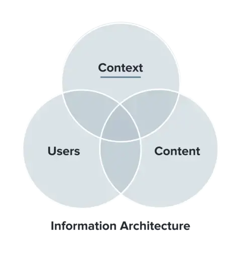
This diagram from usability.gov illustrates information architecture as the overlap of three encompassing areas.
Designers spend most of their time working with user research and patterns (left); Strategists dive deep into the content and strategy aspect (right). The last area (top) is where we want to focus because it provides concrete meaning for the other two areas.
Context matters when users' goals change (hint: always). To create a good user experience for everyone, we need to consider edge cases and variations. If we always present the same thing with the best-case scenario in mind, we'll miss providing value to many users.
Or worse.
There are many examples of goofs on Facebook. Once, they celebrated a moment in time that had a high engagement, but it was the tragic loss of a loved one. Another time, they cross-promoted something meant to be hidden and outed someone to their family.
Certain patterns might work well enough most of the time. But all it takes is a single outlier to create distrust or cause harm.
What kinds of context are there?
We will focus a lot on website users, but there are contexts to sort through on a project before we even start. These can include:
- Conflicting goals: Different stakeholders can have goals that conflict with each other and with site users.
- Limited funding: Budget is always a factor and can increase or decrease the scope.
- Muddying politics: Personal and corporate politics can exist even outside of government. You're probably missing some history.
- Fear culture: Fear can keep an organization doing things the way it has always done, avoiding anything with a hint of risk.
- Legacy tech: Limits can come from a current technical build, forcing them to build on top or start over.
- Missing knowledge: Does everyone understand? Missing knowledge could be technical, industry, best practices, or even about how the site works today.
All of these can shape a project or limit the potential answers to a question. You might even have experienced this.
Next are some contexts for end users of a website.
- Devices and connections: Work computer versus personal computer. Phone versus iPad. Free airport wifi versus a cellular network. These all provide different experiences.
- Physical environments: Environment includes physical spaces, plus more holistic aspects. Maybe someone uses the same device but from a cafe or while waiting on the tarmac in an airplane.
- Social, organizational, and cultural environments: What is the society and culture in which someone was brought up? These can be deeply rooted, and so might not change much.
- Levels of knowledge and familiarity: A new user will interact with your website differently than a returning user or a repeat power user.
- Phases: Where is the user in an organization's funnel? Similar to familiarity, a phase summarizes a state or action common to an audience.
- Emotional states: Different moods can add nuances to how users interact with an interface.
- Abilities: People have varying levels of motor, cognitive, visual, and auditory abilities. These can also change daily, and limitations can be temporary or permanent.
- End user: Consider the use case of a 'knowledge steward.' Stewards aren't the final end users but share information with another, perhaps a family member or someone who speaks English as a second language.
How might context impact UX?
Every factor so far can affect a user experience, and sometimes one another. Once you combine all the context, you can understand just one person, in just one moment.
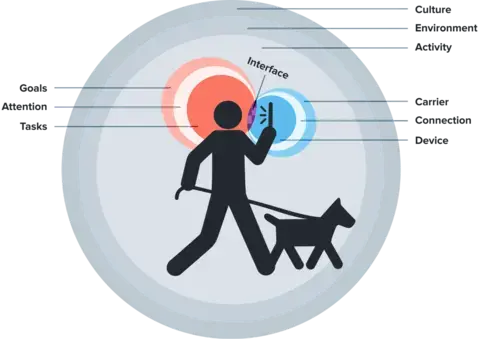
This is a re-illustrated infographic originally by Nadav Savio and Jared Braiterman. Treat the circles like this is a Venn diagram. A person walks his dog with their phone in front of their face. Behind them are three sets of circles.
Culture is our biggest circle and the most deep-rooted within a user's context. Environment is the next smallest circle, followed by Activity, each offering more variation. Behind the person's head are Goals and Tasks, with Attention between them. Behind the phone are three more circles: Carrier, Device, and Connection.
Last is that tiniest little colored spot between the person's perspective and their device's presentation: Interface, the actual experience.
Two seconds after we map their state, maybe their dog sees a squirrel. The person tugs the leash, affecting attention. Maybe it knocks the phone out of their hand: perhaps now the device is missing, and their mood has changed.
Take the same task but at different times: looking up a plumber. You look up a plumber one way when you're researching a future bathroom remodel. You look up a plumber an entirely different way when a pipe has burst, and you're stressed and need results.
What comes next?
We know. This is a lot of variety to consider individually, let alone how they compound together. The following article will cover user research and how to learn about your site and its users. We'll also provide examples of ways your site architecture can adapt to an ever-changing landscape.
The most indispensable ingredient of all good home cooking: love for those you are cooking for.
But, for now, imagine it: your users will feel seen and taken care of because you've addressed all their use cases instead of giving them the old "one size fits few."


