Mass.gov is the digital front door of the Massachusetts state government. Constituents visit the site to get things done, like renewing their driver's license, applying for unemployment, and more. Mass.gov funnels users to the appropriate applications based on the user's needs.
In practice, this means directing people to a lot of agency sites and online forms. The problem is that most of these forms are not controlled by Mass.gov, and for the forms that are, they are third-party applications. We don't have control of the markup, so we can't conform them to Mayflower, the Mass.gov design system.
How did we streamline these forms and make it easier to claim benefits?
This article is based on a talk at FormFest 2024 with Molly Taaffe from Last Call Media and Minghua Sun from Massachusetts Digital Service. View additional insights from the FormFest conference.
A centralized hub for constituent identity
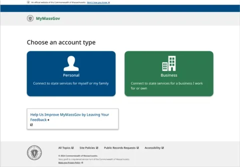
A part of the solution (and still a work in progress) is MyMassGov, a centralized hub that makes updating information and accessing state services quick and easy.
It consists of three types of functionality:
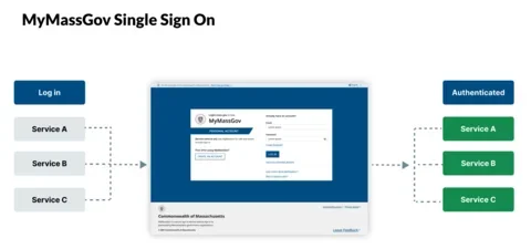
- Single Sign On - Constituents can create an account and sign on to services using a single username and password.
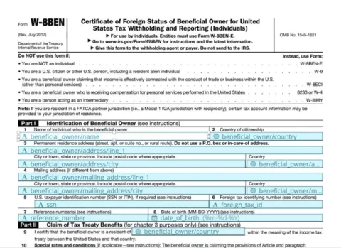
- Universal Profiles - Constituents can fill out information such as name, address, and phone number in MyMassGov. Then, they can share this information to pre-fill out application forms when applying for Massachusetts State services.
- Identity Verification - If constituents have already been verified through MyMassGov once, they sometimes won't need to be verified again to apply for a different state program.
To collect all the necessary information from constituents, MyMassGov needed to focus on forms encouraging them to fill out the necessary information. The hub would only be as easy to use as its forms. We want constituents to fill in as much information as possible by creating an experience that is easy, accessible, and efficient experience.
Why more form digitization is needed
We've all been subjected to an overwhelming PDF form that requires downloading, printing, and following a dozen other steps. These steps are cumbersome, inconvenient, and confusing. The public spends over 10.5 billion hours each year completing government paperwork, and even with that high number, about $140 billion in potential benefits go unclaimed.
In 2014, California had a participation rate of 66% for its SNAP program CalFresh. Benefit forms were digitized with an application named GetCalFresh, and by 2020, the participation rate had risen to 77%. Now, 73% of online SNAP applications in California are submitted through GetCalFresh. Greater access means greater participation.
But just replicating PDF forms to an online equivalent isn't enough. A wall of never-ending form fields can be intimidating. And users with disabilities, using screen readers and other assistive devices, must be able to navigate the process.
Making MyMassGov forms as easy to use as possible
Focused flow
The team researched several different flow types and groupings of form fields. Based on the results, we created a focused flow that only includes one to two questions per page. A progress indicator is included on the screen to help constituents where they are in the form process. During usability testing, we heard lots of positive feedback from the design on this form flow.
A quote from one of the research participants:
I get overwhelmed by too much information so the step-by-step process with only one or two things to fill out on each page really helps me focus.
Form component updates
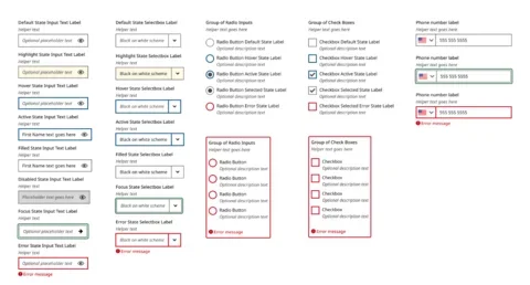
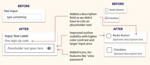
Below is a brief visual overview of the types of components we updated to make them more accessible. We often looked to the United States Web Design System for inspiration and guidance.
Some of the specific things we changed:
- Added a placeholder field so we didn't have to rely on placeholder text.
- Improved the outline visibility with higher color contrast and a larger input area, which makes it easier to tap on mobile phones.
- Added icons so features like "view password" could be toggled.
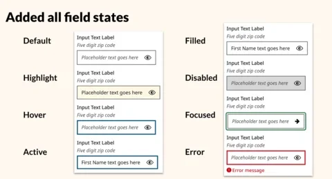
- Implemented designs for all field states. Default, highlight, hover, active, filled, disabled, focused, and error states all look distinct.
Making MyMassGov accessible
Accessibility has been a priority from the beginning of the MyMassGov project and involved the adoption of all current accessibility standards, including:
We also incorporated ARIA into this project to create relationships between different elements. These relationships help users of assistive technology (AT) access this content.
Let's highlight the top three accessibility features for this project:
- Form labels
- Focus behaviors
- Alerts and messages
Form labels
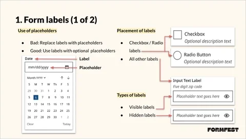
The first accessibility features are form labels. Their purpose is to provide a meaningful label for each form control.
Use of placeholders
MyMassGov uses placeholders only to supplement the form field. Never use placeholders to replace labels. Instead, use them in addition to labels as needed.
Placement of labels
The current implementation of MyMassGov uses left-to-right languages by default. They plan to incorporate international languages soon.
In left-to-right languages, place labels to the right of checkbox and radio fields and above all other fields. For right-to-left languages, consult with the local accessibility standards.
Types of labels
On MyMassGov, form field labels are visible by default. Visible labels help all users, especially those with cognitive disabilities. When hidden labels are necessary (i.e., header search), create them using one of three methods:
Method 1: Keep label + use CSS
- Moves the label out of the viewport
- Often uses CSS classes
.sr-onlyor.visually-hidden
Method 2: No label + add aria-label attribute to form field
Method 3: No label + aria-labelledby attribute to form field
Required fields
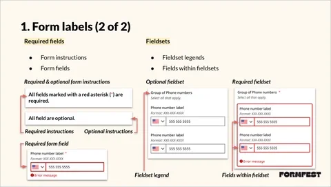
MyMassGov marks each required field with a red asterisk. If required fields exist in the form, they are also mentioned in the form instructions. Otherwise, they use an optional message.
It's important always to identify each required field in a form. Add "required" text or a red asterisk to the label so screen readers can read it aloud. This clarity also helps sighted users by giving them expectations for each form field.
Fieldsets
MyMassGov uses a thick red border around fieldsets and fields within it if errors occur.
Always add a legend for any fieldsets because a legend acts as a label. Fieldset legends automatically get connected to the fields within the fieldset. All fields within the fieldset should have their own unique labels.
Focus behaviors
The second accessibility features are focus behaviors. They aim to provide a clear method for identifying fields receiving keyboard focus.
Keyboard tabbing
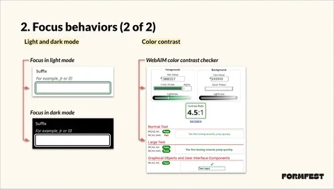
MyMassGov designed and implemented clear focus visibility and a logical tabbing order. It has its own visual styling, separate from hover styling. It also exceeds the Level AA requirements. Its 3px solid line achieves Level AAA SC 2.4.13: Focus Appearance.
Logical tabbing order
Assistive technologies and keyboard users use tabbing to access content. The keyboard tabbing order should always match the visual order on the page.
Light and dark mode
All elements on the page, including focusable elements, include light and dark mode. In dark mode, every focusable element has a thick white line around it on keyboard focus.
Color contrast
All elements on the page, including focusable elements, meet the following color contrast requirements:
- Text elements like text, headings, etc. - 4.5:1
- Non-text elements like buttons, icons, etc. - 3:1
The form field focus states pass at 4.5:1, beyond the success criteria for non-text elements.
Alerts and Messages
The third accessibility features are alerts and messages. Their goal is to provide alerts and messages for all users, regardless of their user agent or assistive technology.
Forms
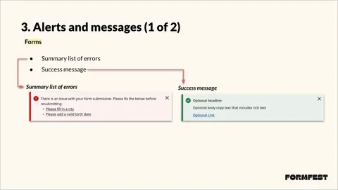
MyMassGov uses consistent alerts and messages throughout the application. Alerts also appear above the form, along with form instructions.
- Summary list of errors: Alert containing brief message and list of errors linked to focusable fields.
- Success message: Confirmation message for successful form submission. The user also receives a matching email notification.
Both contain custom-colored backgrounds and matching icons.
Fields
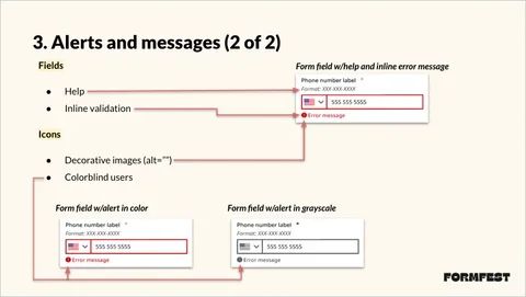
MyMassGov added optional help text and required error messages for each form field.
Optional help or suggestion messages are displayed between the label and form field. This placement helps users with suggestions like formatting and giving context.
Inline validation error alerts are in bold red font and have a red warning icon, which makes them stand out from other text. They are connected to the label and field with ARIA attributes.
Icons
MyMassGov includes icons with every alert, whether inline or for the whole form.
Alert icons are decorative images because they don't add anything meaningful to assistive technology users. They don't receive keyboard focus and have empty alt text (alt=""), which is different than no alt text (alt).
Always add icons to form alerts, which is true for whatever kind of alert you create, whether inline or not.
MyMassGov's motivation for incorporating accessibility
There are a lot of people with one or more disabilities who simply want to access content and services. We should all remember that:
- According to the Centers for Disease Control (CDC), 28.7% OR 1 in 4 - Adults in the U.S. have one or more disabilities
- According to the World Health Organization (WHO), 16% OR 1 in 6 - People globally have one or more disabilities
With this in mind, the team worked hard to make MyMassGov accessible for all citizens of Massachusetts.
Constant improvement
What's next for the forms in MyMassGov? We are launching a continuous research program to continue learning from constituents about form flow and ease of use. We're also establishing solid benchmarks to measure improvements more accurately. Finally, we're monitoring constituent feedback through surveys they can access throughout MyMassGov.
The results so far
But we've already seen success.
Within a year, the constituent single sign-on platform used by more than 80 websites grew to 1.5 million users, including over 500,000 active monthly users.
These numbers will continue to grow as we onboard more agencies.
MyMassGov also won the 2024 Government Experience Award, and the Commonwealth of Massachusetts took first place for the Overall State Government Experience.

