I’ve been a designer for a decade but within only two dimensions. Recently, I had my first opportunity to design for virtual reality. Enter Lullabot VR, born while brainstorming ideas for a conference booth. It was my favorite type of project: a skilled internal team doing something fun, with time our only constraint. We were all excited about the idea, to build a VR microsite to accompany a Lullabot Cardboard headset, but I wondered: would this curiosity be enough for me to provide useful art direction and assets for the developers before DrupalCon? Spoiler: with a couple of VR design projects under my belt, I can say that there is a place for UX designers to contribute to a VR project, even without 3D modeling skills.
What a time we live in and have the privilege of designing for. We’re able to expand our horizons beyond traditional design with experimentation within this new medium, and more generally flex our design muscles and get inspired. In this article, I will share with you how a curious UX designer can get involved with VR, using the process and resources that worked for me.
Before the project even begins: do your research
Any user experience designer worth their salt begins with a deep dive, learning the medium, goals, users, and overall context of the project. This is no exception! If you can, block out time for learning before you have a specific project with a deadline. It’s up to you however you learn best; there are a lot of videos, articles, and even textbooks out there. Before you drown in material, start with a few of my favorite resources:
- Of course, Google. Google is an innovation powerhouse in many spaces, and you’ll find that VR is no exception. A number of influential VR talks have occurred at Google’s I/O conference: watch 2016’s VR Design Process session for helpful context, then catch up and watch 2017’s VR keynote.
- Mike Algers is an Interaction Designer and a good speaker with lots of introductory VR design videos. Watch his VR Interface Design Manifesto.
- Our very own Lullabots love to share our VR experiences (surprise!). Jerad Bitner has a slew of VR Design articles out now, my favorite of which is A New Dimension for Designing the Web. Wes Ruvalcaba and David Burns also recently spoke on Virtual Reality on the Web at DrupalCon Baltimore; thankfully, you can watch their session recording right here.
- And if you really want to drink from the fire hose: uxofvr.com is full of resources and fun to explore.
Buy a Cardboard
This is about as far as you should go without actually getting into a virtual experience. As I’ve heard David Burns say before popping his headset onto other Lullabots, “You gotta try it to believe it!” This is a huge part of your research, to understand what you’re actually working towards. But don’t be scared by price tags or intensity of the hardware options out there. Google is so awesome that they offer nice headsets under a hundred bucks (and no, I am not affiliated in any way). You can purchase an official Google Cardboard headset on Amazon for fifteen dollars. Go ahead. I’ll wait.
Two days later, the research begins
As part of the setup process, the Google Cardboard offers a demonstration app accessed as part of the setup process, which is a logical first step for your exploration. Next, I’d suggested the app Google made just for designers like us: the Cardboard Design Lab, which demonstrates VR design principles with beautiful examples (and if you’re an iPhone user that can’t download the app, you can at least watch this walkthrough video).
After that, there are many apps and options out there for you to play with. To avoid spending a whole week inside your phone, I suggest you start with a couple 360° videos and a couple apps, to review experiences and patterns at a high level; then, circle back to specific examples later, as you have specific questions or interactions you want to document.
Here is one more resource that is actually many: VRtually There is a weekly series of 360° videos curated by USA Today. You can also find videos on YouTube, but either way, I highly recommend watching immersive videos.
The whole VR experience really clicked for me while I was enjoying a hot air balloon ride over Africa. From my apartment.
Of course, there is way more to virtual reality out there now, with technology that allows us to move freely between sensors, or interact with your environment using hand-held controllers and robust menu UI. My initial goals were scoped to VR for the web, using A-Frame, so this sort of heuristic isn’t meant to be comprehensive. If you know someone who’s got the gear, schmooze your way into a demo to experience what other designers have come up with! Games transform controllers into a variety of weird tools and weapons and are often set within inspiring scenery design. My personal favorite experiences were learning how to use the interface within creative tools, which I’ll geek out about in the Digital Explorations section.
Good old-fashioned documentation
Let’s get down to the business of design exploration. Though our medium is different, much of our goals remain the same as designers. For simplicity’s sake, we’ll consider two areas of focus: UX and UI.
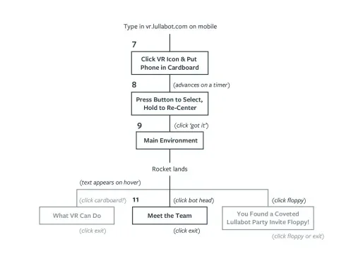
In regards to the first, creating an enjoyable user experience, we can use tools you will likely find familiar without an in-depth walkthrough. Research should continue into the project with user research and product development. Define your intended audience and what the experience should let them do, then map out the users' journey as they flow through the design to meet those goals. You can share documentation in a scrappy way or at higher fidelity, but it’s important to align the group.
Use whatever your UX templates of choice may be: sketches of notes and arrows; spreadsheets of user stories; elaborate customer journey maps; workshops that end with a wall completely covered in stickies; what have you. They’re all a great starting point for prototyping.
Brainstorm and prototype together
Prototypes can be anything that tries out a concept and helps you share it with others, from rough demos that you can generate, to higher-fidelity code written by developers.
If a picture is worth 1000 words, a prototype is worth 1000 meetings.
Tom & David Kelly of IDEO
This is one of the ways in which I found VR design to exaggerate an aspect of web design: anyone not working in code is not actually making VR experiences, we’re making pictures of VR experiences. As a full-time picture-maker myself, I don’t mean that in a disparaging way, and value these communication tools when sharing with my team. It’s good to remember that our artifacts will serve a purpose, then ultimately be thrown away. Let go of pixel polishing!
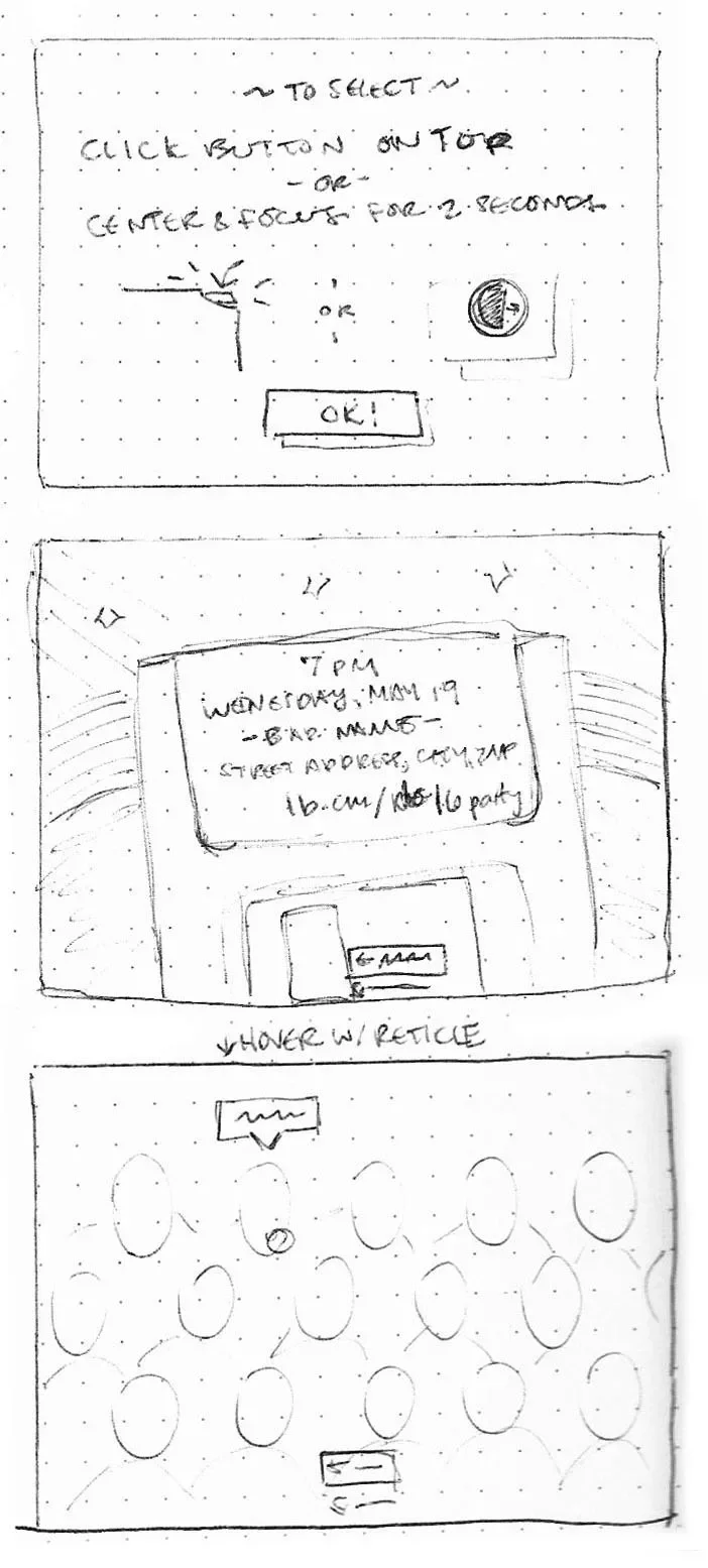
You can solve these new UX problems the same way you do for 2D, with a pencil or a whiteboard. Sketch out quick ideas to explore UI and layout options.
For our VR project, the team brainstormed the environment and its interactions together over a Google Hangout. The two designers took notes and sketched as we went, ensuring the group was on the same page. If you can’t always meet, try recording yourself walking through sketches. For in-person walkthroughs, paper prototyping is another great method.
Take your prototyping to the next level with this 360° sketching template: follow the panorama grid to align your scene to a wide angle view, then scan and upload it to view inside your headset. It takes some experimentation to get familiar with how the scale translates.
OK, enough paper: digital explorations & UI design
Working at greater detail in a digital medium inevitably pulls into view our second area of focus: designing the UI. This can take a variety of forms, depending on your comfort level. But at the very least, UX designers can lend art direction to provide a sense of style. Like any web project, your VR environment will need some visual assets. I myself didn’t write any of our code, I created artifacts that the developers built upon, then threw away. Like a Codepen that matters for a couple hours, or a quick animation pattern illustrated with an app like Principle, use whatever tool helps you create the specs you need.
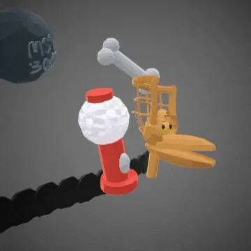
The best digital explorations are those unlocked by using robust VR headsets like the HTC Vive or Oculus Rift, which offer exciting opportunities for creating assets that you can walk around while you work. Even just a handful of times building in three-dimensional space really changed my perspective. I found two apps to be especially helpful: Tilt Brush and Google Blocks.
Tilt Brush allows you to paint inside a virtual canvas like a modern MS Paint, with a palette full of new weird brushes. I used it to sketch out a layout wireframe, but users can create fine art with it too.
Of all the 3D modeling tools I’ve tried, I most enjoyed experimenting with Google Blocks. The simplified interface was easy to use and lets you get down to business quickly.
VR design in Sketch
Don’t worry, you don’t need a room full of gear to lend a design hand. Instead, you can use your design tool of choice to communicate ideas at a higher fidelity. We use Sketch.
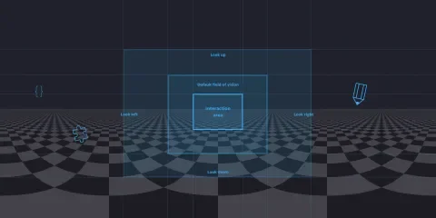
My first attempts at laying out a scene resulted in a cumbersome UI that took up my field of vision and looked as if it would crash down on me at any moment. With the help of a teammate, I created this VR template for Sketch as a reference image to help me translate scale from one medium to the next. It also gives you a grid to reference with sections marking different areas of vision, as well as examples of legible type at each size. I hope it’s a handy reference for you too!
From here, you need to upload your Sketch mockups somehow to preview them in your Google Cardboard. I uploaded my screen exports to VRupal, an open source content management project by Lullabot’s own Dave Burns. VRupal lets you upload assets within a simple web interface. From a URL, you can then view the imagery in your headset or easily share it with others. This makes this deliverable good for conducting usability testing before the first line of code. Alternatively, this Sketch to VR plugin is another way to go: it lets you export a front interface layer and a second background behind it, and preview them from a local server.
And finally, exporting assets in Sketch has always been simple using the Export menu found in the inspector. Thankfully, we can provide developers with SVG files to upload into a WebVR experience. InVision offers a helpful curation of all your Sketch asset exports, but in a pinch, we passed files back and forth in Slack.
The first VR experience of many
In the end, the team shipped a small VR microsite that was just a portion of our original brainstorming. But done is better than perfect! And it was a great way to dip a toe into the world of VR.
I discovered that there is much more to learn about this new landscape. For one thing, I’ll be brushing up on my 3D modeling skills in the future. And I’ll want to be better versed with the capabilities and limitations of creating WebVR with A-Frame. As the excitement for VR gains momentum, there are sure to be a slew of even more tools to master. In particular, I’ve added Ottifox to my shortlist, which was just recently released, and claims to provide a design interface like Sketch that creates production-ready code. No pressure, Ottifox!
But on the other hand, there is much more to the UX of VR than these shiny gadgets. As I hope this article has illustrated, the web designers’ tools are still relevant in experimenting with web VR; that any experience can benefit from design strategy and research and that good old vector mockups can still bridge the gap between design and development teams.
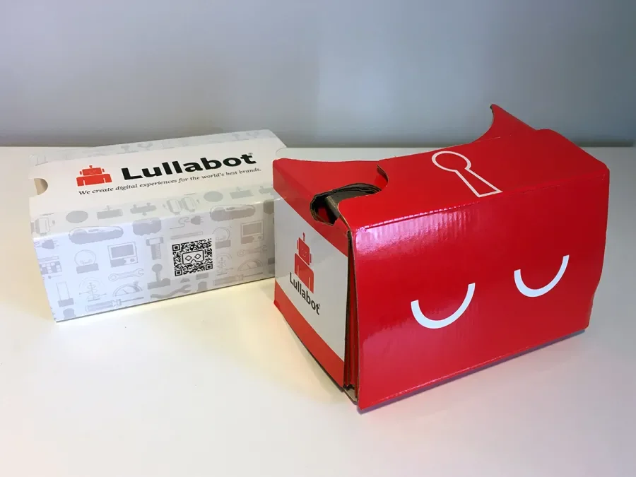
And there was another, more obvious nod to more traditional design as part of the project, that was too fun for me to not share: the design of the printed headset itself was a gratifying task that reminded me of my bygone packaging days.
Ready for your first VR project?
I hope you find designing for VR just as rad as I did! It’s an exciting medium offering next-level immersion, and with that, new challenges for you problem-solvers. I can’t wait to see what you create! And if you discover particularly helpful resources or some advice you wish you’d known, please come back and share it in the comments.
And if you don’t want to dive headfirst into VR design just yet, no sweat! I hope you enjoy a couple hours of immersive fun inside your Google Cardboard.
Keep an eye out for more fun stuff on Lullabot's Playground for Web VR.

